WatchUSeek Watch Forums banner

TUDOR, What's up with the hands of the BB54?

11K views 70 replies 29 participants last post by  maddizm  
#1 · (Edited)
Hi Guys,

As one with slimmer wrists, Im really happy that Tudor came out with the BB54.
BUT, it looks like 1 team worked on the hour hand and another on the minute hand…

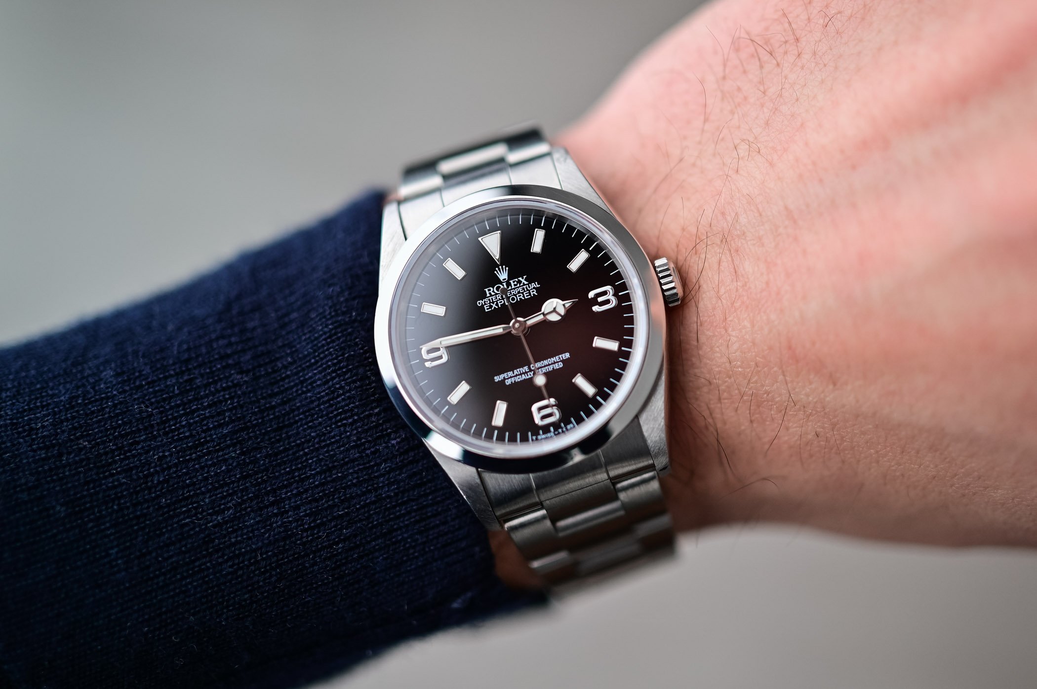
As you can see in the picture, the hour and minute hands of the BB58 and BBGMT match each other in thickness, But the hour hand on the BB54 is slimmer than the minute hand.

To me, this just looks so bad and it can’t be unseen.
I could maybe live without the gilt on the bezel and the red triangle, BUT this is just too much.

This watch looks like it was rushed out the door,
Instead of Tudor taking the time to make another hit like the BB58.

Tudor, Please spank whoever designed the hands of the BB54 🙏


P.S.
The mismatch between the white markers on the bezel and gilt markers on the dial also don’t add to the watch.

Image
 
#2 ·
The handset of the BB54 is modelled after the handset of the 1954 Tudor Submariner, reference 7922. While it might not be to everyone’s taste, this was an intentional design choice, and makes sense given the 54’s source material.
Image


The new burgundy Black Bay and the updated bezelless range all have a similar handset (pinched minute hand and lollipop secondhand), but with the thicker hour hand you prefer.
Image
 
#5 ·
The handset of the BB54 is modelled after the handset of the 1954 Tudor Submariner, reference 7922. While it might not be to everyone’s taste, this was an intentional design choice, and makes sense given the 54’s source material. View attachment 17388088
Wouldn't it of been better if they took the good things from the 1954 Tudor Submariner, instead of the bad things?
They shouldn't of made the dial in gilt and that would of made it much closer to the original. they really didn't have to mess with the hands.
 
#11 ·
Since buying the BB54 on 4/1, I have taken an interest in reading about the early Submariners that inspired the Black Bay line. I think the BB54 is as close to a reissue as Tudor or Rolex will ever do…there are lots of little details, like the smaller hour hand, that Tudor pulled from the originals. I found these articles interesting:

(One note above, they incorrectly state the red triangle was on the 1954 Sub, it did not appear until the 1958 model, hence the red triangle on the BB58).

This article on the 1953 Rolex was especially detailed:
 
#21 ·
I think that even the Tudor designers think it looks terrible and that's why they only changed the hour hand of the BB54, to make it more "original".
If they thought it looked better, they would of done so also on all new BB31/36/39.
 
#30 · (Edited)
By that logic all Tudors would have the same hands. The diamond seconds hand is gone on some but not all models. There are different sized hands for each size model. Doing something different on a watch but not the whole line says nothing about what a designer prefers. They made a smaller, thinner snowflake because it’s a smaller dial watch…they said so in W&W interviews. I don’t know, or care, why they didn’t do that for the BB36.

You don’t like the hour hand on the BB54. You don’t mind the gilt on the bezel of the BB58 like I do. So don’t buy the 54. But don’t assume it’s some kind of objective mistake.
 
#32 ·
They made a smaller, thinner snowflake because it’s a smaller dial watch…they said so in W&W interviews.
It's clear that they scaled down the dial, hands etc. to match the new 37mm case size.
Im just saying that if the hour hand was also scaled down but not slimmed down, it would've been more pleasing to the eyes.
The proportions of the BB58 are great. they just needed to scale it down to the new case size.
The hour hand on the BB54 looks like it hasn't had a meal for at least a year :)
 
#35 ·
Well OP, clearly is the way that it is, some like you don’t like it, some as you have read, do. Being something of design, originality etc, might be an argument, but then same outcome: some like it, some don’t…and I think is a discussion with every new watch. Some like it, some don’t. FWIW, I think Tudor listened to the slim wrists out there and delivered. For me? I like it, and I just saw the hand “issue” (for me it isn’t ) when I read the thread
As you said, for each, their own. 100% agree on that
 
  • Like
Reactions: Roy1988
#44 ·
Remember how Cartier came out with the iconic tank watch, then modified it in every possible way, and most of them were beautiful and they were still instantly recognizable as Cartier tank watches?

The new Tudor is still instantly recognizable as a Tudor and has the same matte look and the snowflake hour hand. They're not ruining it.

I like the "lighter look" hour hand. Suddenly the old one looks unnecessarily wide.
 
#46 ·
In looking at my BB54 and at pictures online, the thickness of the BB54 hour hand looks roughly the same as the minute hand, but the metal is wider and the lume is thinner. In looking at the BB58, the hour hand is wider than the minute hand but the lume plot widths are the same…which is the OP’s preference. In looking at the 41mm GMT, the hour hand AND the lume plot is wider than the minute hand (this is easiest to see in pics of the new white dial version).

Looking at Tudor (and Rolex) watches of prior decades, it’s all over the place. The original 1970’s snowflake submariner had an hour hand much wider (the hand and the lume) than the minute hand. In that case, it really does look like an afterthought…I wonder if they used the minute hand of the prior generation, with the new snowflake to meet French Navy requirements?

The Tudor and Rolex subs (they shared handsets) of the 1950’s and 1960’s seem to be all over the place. Most seem to have a thinner Mercedes hour hand, but some, like the Rolex 6200, have a long Mercedes hand that looks wider. Apparently there was variation on what hands were used even on the same year and model, including pencil hour hands in the early fifties.

Bottom line, there has never been consistency with the width of Tudor hour hands, and there still isn’t. Pick what you like.
 
#58 ·
It doesn't seem so from the picture, but got to see it in person.
It seems that the BB54 hour and minute hands are of the same width, but the minute hand was cut further from the center and therefore has a larger lume area.
 
#65 ·
Tudor and Rolex both have awful digital renderings for some reason. I tried it on last week and it seems like the hands are matching to me?

View attachment 17391975
Yes the hands are the same width but the lume track is slightly thinner (and the metal wider) on the hour hand. Everyone has different preferences, but IMO this is much less of a big deal (for better or worse depending on your preference) in real life versus images. I agree that Rolex and Tudor renderings are terrible. I’m biased but I think the handset looks great in person.