
G-Shock GMW-BZ5000 with MIP LCD display and new structure leaked, plus mini ring-sized DWN-5600 rumor - G-Central G-Shock Fan Site
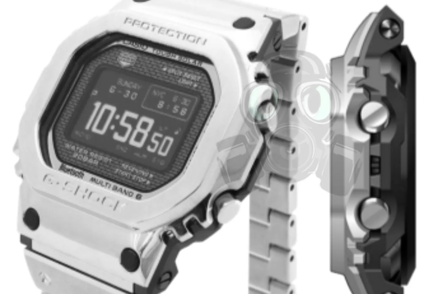
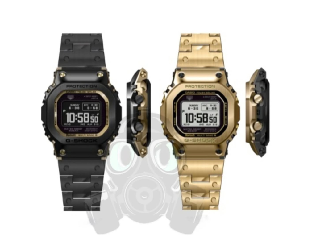
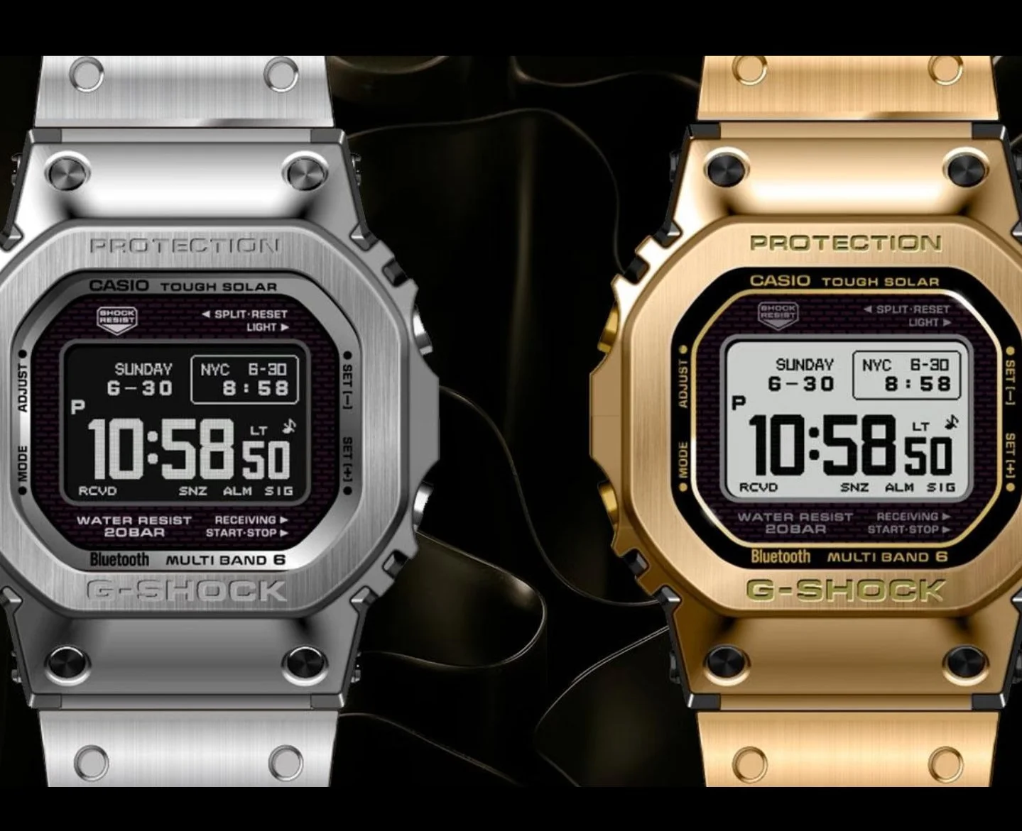
G-Shock enthusiast Geesgshock leaked images of the upcoming G-Shock "GMW-BZ5000" with an MIP LCD display and a new type of case and bezel structure. The new
Happy to see a MIP display coming to our beloved square shape. Will be interesting to see more details as far as the case construction, because it's quite a bit different than the current GMW-B5000s. Is it still a true full metal, or a G-Steel sorta thing? Will the bracelet be any better, or have better articulation? Will the current GMW-B5000 resin strap fit these new ones?
The black with gold accents is pretty hot IMO.
Pics from geegshock on Instagram :: https://www.instagram.com/geesgshock/