
I happened upon this video by Watchfinder regarding the Daytona that just got uploaded today. I personally find the Daytona unappealing for several reasons, but let's first go over the 5 things the video offers as a critique of it before we go into what irks me about the watch.
1. Lack of a date display - the lack of functionality is annoying, but some people prefer the cleaner look, so I won't count this against the Daytona. I'll never understand the hate for the cyclops; it's quintessential to Rolex.
2. Platinum engraving in the ceramic bezel - It will get dirty over time but this applies to all Rolex watches with ceramic bezel inserts. A soft toothbrush and dish soap is probably the solution here.
3. Polished Center Links - I'm okay with PCL's although these will admittedly get scratched up even with minimal wear. A Cape Cod polishing cloth is an easy DIY solution and when you send the watch in for a service, Rolex will make sure it gets back to you looking nice and shiny again.
4. Screw-down chronograph pushers - Now this, I will agree with Watchfinder on. This really impacts the ease of using the chronograph if you have to keep screwing and unscrewing to use the complication, and will cause excessive wear on the threads. If Omega and even Sinn can offer chronograph actuation underwater, I don't see why the Daytona can't match even the new Chronomat. The Breitling is 200m water resistant without the need for screw-down pushers.
5. Impossible to get - This is true if you're waiting for the AD to give you a call. If you have the money, these are readily available on the grey market.
Now, let me get into why you shouldn't be paying the tens of thousands being asked for this model.
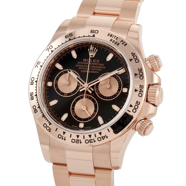
1) The small novel's worth of text on the dial.
Rolex
Oyster Perpetual
Superlative Chronometer
Officially Certified
Cosmograph
They even fit "Daytona" in there between the sub-dials. All this leads to a very cluttered dial that just looks too busy. Other Rolex models also have too much text for their own good, but at least there is space on those dials to let let the words breathe.
2) Poor legibility.
Tying in to my first problem with the Daytona, not only is there a lack of real estate on the dial, the sub-dials themselves are very hard to read and not at all legible. Even just trying to read the time on the black Daytona can be an issue for those with poor eyesight. The panda dial is a little better in this regard, but you pay for that slight bit of better legibility with an even greater premium.
3) The lugs on the crown side are thinner than those at the 9 o'clock side.
Once you see this, you can't unsee.
4) The hour and minute sub-dials are not centered.
Once again, as soon as this registers, you will always realize those two sub-dials shatter the symmetry of the dial and the watch as a whole.
So now that you are aware of all the flaws of the modern steel Daytona, are you still on board the hype train? Vintage Daytonas are actually quite nice and are excluded from my scrutiny. Personally, if I had the budget to hunt for a Daytona on the grey market, I would rather go for something more upscale like the APRO Chronograph. If I wanted to purchase something with heritage, the Speedmaster actually passed NASA's tests and went to the moon, unlike the 'Cosmograph'. It also costs a fraction of what you'd pay for the Daytona.
I love an extensive number of references from the Rolex catalogue. The Pepsi, Batman, Z-blue, Polar, Y-M Blue, DJ 41 Slate... so many sexy watches. But the Daytona? Nah.
1. Lack of a date display - the lack of functionality is annoying, but some people prefer the cleaner look, so I won't count this against the Daytona. I'll never understand the hate for the cyclops; it's quintessential to Rolex.
2. Platinum engraving in the ceramic bezel - It will get dirty over time but this applies to all Rolex watches with ceramic bezel inserts. A soft toothbrush and dish soap is probably the solution here.
3. Polished Center Links - I'm okay with PCL's although these will admittedly get scratched up even with minimal wear. A Cape Cod polishing cloth is an easy DIY solution and when you send the watch in for a service, Rolex will make sure it gets back to you looking nice and shiny again.
4. Screw-down chronograph pushers - Now this, I will agree with Watchfinder on. This really impacts the ease of using the chronograph if you have to keep screwing and unscrewing to use the complication, and will cause excessive wear on the threads. If Omega and even Sinn can offer chronograph actuation underwater, I don't see why the Daytona can't match even the new Chronomat. The Breitling is 200m water resistant without the need for screw-down pushers.
5. Impossible to get - This is true if you're waiting for the AD to give you a call. If you have the money, these are readily available on the grey market.
Now, let me get into why you shouldn't be paying the tens of thousands being asked for this model.
1) The small novel's worth of text on the dial.
Rolex
Oyster Perpetual
Superlative Chronometer
Officially Certified
Cosmograph
They even fit "Daytona" in there between the sub-dials. All this leads to a very cluttered dial that just looks too busy. Other Rolex models also have too much text for their own good, but at least there is space on those dials to let let the words breathe.
2) Poor legibility.
Tying in to my first problem with the Daytona, not only is there a lack of real estate on the dial, the sub-dials themselves are very hard to read and not at all legible. Even just trying to read the time on the black Daytona can be an issue for those with poor eyesight. The panda dial is a little better in this regard, but you pay for that slight bit of better legibility with an even greater premium.
3) The lugs on the crown side are thinner than those at the 9 o'clock side.
Once you see this, you can't unsee.
4) The hour and minute sub-dials are not centered.
Once again, as soon as this registers, you will always realize those two sub-dials shatter the symmetry of the dial and the watch as a whole.
So now that you are aware of all the flaws of the modern steel Daytona, are you still on board the hype train? Vintage Daytonas are actually quite nice and are excluded from my scrutiny. Personally, if I had the budget to hunt for a Daytona on the grey market, I would rather go for something more upscale like the APRO Chronograph. If I wanted to purchase something with heritage, the Speedmaster actually passed NASA's tests and went to the moon, unlike the 'Cosmograph'. It also costs a fraction of what you'd pay for the Daytona.
I love an extensive number of references from the Rolex catalogue. The Pepsi, Batman, Z-blue, Polar, Y-M Blue, DJ 41 Slate... so many sexy watches. But the Daytona? Nah.