WatchUSeek Watch Forums banner

Watches Referencing Architects

6 reading
31K views 150 replies 23 participants last post by  Benjamin NV  
#1 ·
My interest in the relationship between watches and architects started with the seminal designs of Max Bill for Junghans in the 1960s, which a friend alerted me to. Max Bill was a multidisciplinary Bauhaus artist and designer, whose remit included architecture. To my knowledge Junghans has kept reiterations of Max Bill’s designs in their catalogues ever since. His watch designs still enjoy considerable popularity and have influenced many minimalist and Bauhaus inspired pieces since.
Image


In fact, I would argue that purchasing a Junghans Max Bill has turned out to be my gateway into watch collecting a few years ago. It was the first ‘serious’ watch I bought myself after having been gifted a nicely classical automatic Frédérique Constant eons before.
Image


So, what is my purpose with this post? For long-term members among us, well over a decade ago @jporos started a thread on a somewhat similar pursuit: Architect/Artist Designed Fashion Watches. Now, if the passage of time wasn’t enough to revisit this, I up the ante by stating I’m not particularly interested in accessible ‘fashion brand watches’ penned or merely co-branded by architects. Nor am I necessarily looking for watches destined or deemed suitable for those in architectural professions. Instead, my double pursuit in this post is to discuss and build a visual collection of qualitative watches that:

1. Have been designed by architects (or designers who also practiced architecture)​
or​
2. Watches that explicitly reference architects (for example in the model name).​

We might end up discussing why the latter group of watch models are called ‘architect’ – these also exist among fashion brands (or indeed the unremarkable thirteen-to-the-dozen Architect London Personalised Watches For Men & Women | Engraved Minimalist Watches UK watch brand) – or what motivates architects to branch out into watch design. But I’d also appreciate just collecting and critiquing examples of watches you know of (or own) that reference architects. In addition, I have seen watch designs being described as ‘architectural’ in a figurative sense. So what constitutes an ‘architectural’ watch in watch design to you?

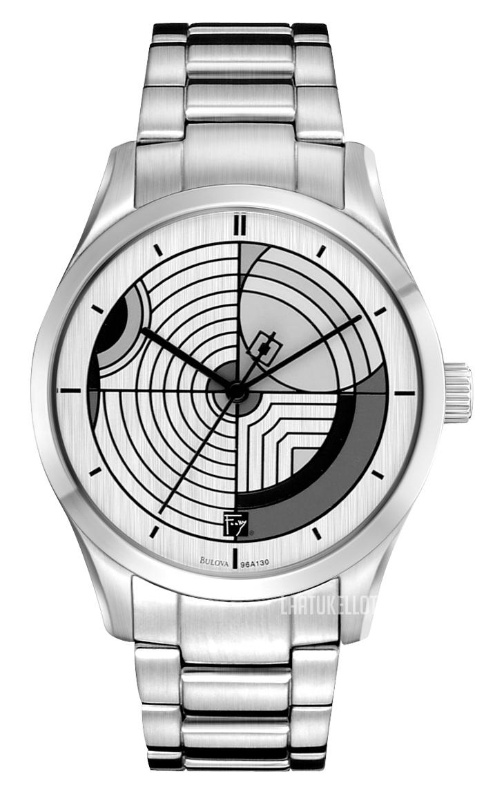
I’ll kick off by giving recent microbrand examples of each.
  • Designed for microbrand Bravur by Gert Wingårdh, because it was my first microbrand watch:
Image

  • Estonia 1918 Arhitekt, because I am rather taken with this pretty high-end offering (I found out about this watch brand via WUS thanks to @Finnish Joe)
Image

  • Batavi Architect, because it is from my motherland (pictured is ‘blue steel’ which I find most in keeping with minimalist expectations, but they did various dial materials, colours, and designs so far)
Image

Over to you, lovely, knowledgeable, and interesting people of WUS.
 
#3 ·
Though based on the examples called architect, I don't think the Bauhaus genre is what determines watches' claims on architects/architecture. Indeed, it is the case that the Windgårdh gives a strong vibe to the line work on the Max Bill. I actually find it difficult to say if I find the more decorative Bravur or the more minimalist Junghans the better option, though I do think the Max Bill has simply proven it's longevity and has reasserted its place in my rotation.
 
#5 ·
I was hoping this thread might generate some ideas. Perhaps this is just an odd interest of mine, or the phenomenon is rarer than I thought (outside of the previously explored architects dabbling in fashion watch brands). I did notice today that Mido has two LE watches in its catalogue that are explicitly 'inspired by architecture'. So, if we assume that there may be an expectation for watches referencing architects or designed by architects to have some inherent 'architectural' quality, watches inspired by architecture would fit that brief, too. Certainly, in Mido's case this is to be taken quite literally, as both models are inspired by a particular iconic heritage building, the Colosseum and the Opéra de Rennes (guess which is which):
Image


Image


The first is possibly more accessibly handsome, but I love the unconventional textured patterning on the second. I just think the handset is a little off. In my opinion I would have expected coherence with the hour markers.
 
#6 ·
Image

"The SEXTANT watch was created back in the 1940s. It was offered, at Le Corbusier, in homage to the amazing architect that he was. Not to mention that her favorite things, was the protractor, the ruler and the compass needle."
Image

"Juvenia is established since 1860, in La Chaux de Fonds, where Le Corbusier was born:
“Charles-Edouard Jeanneret-Gris”, (his real name), was born on October 6, 1887, in La Chaux-de-Fonds, Canton of Neuchâtel, Switzerland, and died on August 27, 1965, in Roquebrune-Cap-Martin in France. He’s best known under the pseudonym of “Le Corbusier”, and was a famous architect, planner, decorator, painter, sculptor and writer, Swiss by birth and naturalized French in 1931."
Source: Wristreview
Image
 
#9 ·
Yes, I think I've seen this before on the old thread I mentioned. It's a very literal approach to an architect's watch, as in, the tools of the architect's craft. For me, this makes it less and architect's or architectural design than a novelty. Perhaps a little like making watches referencing specific buildings, like the Midos I just posted. Did Juvenia really present their design to Le Corbusier, or did they merely pay homage to his achievements?
 
#13 ·
Recent browsing alerted me to two further examples of exactly the thing I was after (suggesting there may be more hidden away).

The first is a model by a brand of some repute and heritage: Girard Perregaux. Incidentally versions of the Laureato, which goes back to 1975, so an early follower of the design language pioneered by the original Zenith Defy (see recent reissue!) and Gérald Genta's Royal Oak, have caught my eye before. I'm including a picture of a fairly recent favourite in this line, simply because it really underlines a dress version within this design approach. The original Laureato was designed by Adolfo Natalini, who reportedly had a penchant for mathematically derived patterns and geometry in architecture. I can see how especially the Defy's case of 1969 would have inspired him.
Image

The second is by valued microbrand Oak & Oscar, in fact, their often praised Olmsted. This turns out to be a watch not designed by an architect, but referencing Frederick Law Olmsted, who is credited as the spiritual father of landscape architecture. No mean feat. How exactly their design references Olmsted I'm uncertain of. One might suspect that honouring him was a thankful way of keeping the alliteration going. I'm posting the grey dial version for internal consistency.
Image
 
#14 ·
A very interesting thread! Somehow I missed it until today.

Okay, let's see. There's Walter Gropius (German Architect and founder of the Bauhaus school) watches
Image


Bulova has a lot of models on their Frank Lloyd Wright collection
Image


Image


Maybe stretching things a bit (he studied Architecture, although, as far as I know, he never actually worked as one), but there's also the Raketa Classic Big Zero Malevich, sort of an "homage" to one of Kazimir Malevich's most renowned paintings the "Black Square". Interestingly, the dial is made of 3 different stones.
Image


Lastly, still stretching things a bit, there's the Hermès Carré H, designed by French architect Marc Berthier and reportedly became known as "the architect watch", given the appeal its design had among architects and designers.
Image


Cheers!
 
#15 ·
This is a fantastic contribution. I only new about Frank Lloyd Wright inspired watches (he didn't do them himself, did he? So it's arguably a little like the Mackintosh before. It's interesting nonetheless and both architect-designers I appreciate. It's funny how I wouldn't necessarily describe the Gropius as a typical Bauhaus inspired watch, even though it clearly connects to that era. Intermittent lines is an interesting way of indicating time, also emphasising time is measured in blocks, like the new premium kids watch brand Blok. The Hermes is interesting because it has its lugs high up on what seems like a hefty case. Great stuff and clearly shows there is not necessarily any shared approach here.
 
#20 · (Edited)
Xezo Architect ( not my picture). My better half have similar model.
Text below is from Xezo website.
"The idea came from observations of ancient classical architecture in general, and in particular the ruins of Erechtheum Temple (on the Acropolis in Greece) finished by 405 B.C. Its unique plan features three facades at different levels, and is famous for complex, exquisite details; most notably the loveliest Ionic capitals Greece ever produced. This timepiece mirrors the temple’s classical beauty in many crucial ways. Each of the reverse columns on both sides of the hand-crafted case signifies one of the shrine’s façades. And the nine rectangular see-troughs--found on the top and bottom of the timepiece--resemble the moldings of the temple’s porch supported by ethereal sculpted figures."

Image
 
#26 ·
Slightly within the topic:
I'm an architect and I designed couple of watches, so I think I just about qualify.

1. Design for Polish microbrand G.Gerlach (featuring ST19 chronograph). Called "Żubr" (Bison) as it's a bullhead design.
Image

Image


2. Another design for G.Gerlach. This time for their 10th anniversary (7750 movement). Design brief was a pilot watch referencing 1930s fighter plane PZL p.11c
Image

Image

Image


3. This one I built for myself out of loose parts from Aliexpress. Self-printed dial and etching done in local engraving workshop. Miyota 8215 movement.
Image

Image


4. And this is a frankenwatch based on Mumbai Special Orient (some sort of birth year design exercise)
Image


Greetings
Eryk
 
#27 ·
Of course this totally counts! Other then this being a kind of curious genre, I was wondering with this thread if there are significant trends or commonalities in these kind of architectural watches. Looking at yours, it further adds variety. The first has a sculptural quality to me, which I quite like. Your self built, to me, has the most obviously architecturally inspired design, especially in the dial, of course. It's arguably more the line of design architects might come up with. The fourth has a graphic design like quality. Thanks for sharing these design here and keep up designing watches! I'd be interested to see what you come up with next. Also, how did you get into designing watches next to your usual profession?
 
#30 ·
Yes, I see what you mean. There may also be reason to recognise a genre of 'architectural watches'. This would be a prime example! I quite like the segmented relief and depth, but to wear it I would be concerned with the overall thickness this must create on the wrist.
 
#32 ·
I've recently learned for myself that every mm over ~10.5mm in thickness is a truly noticeable step up in the wrong direction for me, so 14mm would rule this out. I also confirmed that 41mm is pushing my maximum case size, so 45mm rules this out. In fact I find that on their own worst shots, it looks almost comically big, which is at odds with the rather serious material-driven geometric relief pattern that makes up the design language. I do appreciate the design, but fear it would spend it's days in a cabinet of curiosities... For those into truly big watches, I think it would make an interesting and unexpected choice.
 
#35 ·
I thought I'd link to a post just spotted on the Vivid Dial thread, as the watch designer Alain Silberstein refers to himself as an 'Architecte Horloger'. Fair enough, that's not quite a conventional architect, but since we often talk about 'building watches', it's another nod between the two domains.

 
#36 ·
So, I quite like the drz04 Mondial from Direnzo and have been following the brand for a little while now. A new version has just been announced. That said, I associated the brand with racing, even if that's accurate it is actually quite subtly done, but I'm not entirely sure this is as crucial to the brand as well-considered and detail driven watch design in itself is. What I didn't know is that Sergio Di Renzo himself was a practising architect before starting the brand. With that it actually becomes a prime example of what I was after with this thread. The microbrand store writes the following:

"Sergio Godoy Di Renzo is the creative genius behind the Direnzo Watches brand. When Sergio moved to Geneva, Switzerland in 2014, he was working as an architect, and ended up taking a watch design course for fun. He hasn't looked back since."
 
#39 ·
Thanks to a recent piece on Fratello I heard about Dumoreau watches. A new upcoming release (preorder stage for 975USD... Tempting, I'd say) the DM02 is designed by Carlo Aiello. Already a celebrated and award winning designer, but apparently from an architecture background. I'm not sure of his actual day job (I presume design-related, but not which genre), but this watch have many of the elements I've started to recognise I much appreciate, in particular a dial with a sector or bullseye type ring. I have to agree with Fratello that there is something tranquil yet assertive about the concentricity of this design and the flowing rounded sides of the case. It's excellently sized as well. I'm personally less sure about the hand winding movement, although I understand it suits the genre. I feel like I can see the care that has gone into the crafting of each element from the pictures. I currently can't justify spending over 1000USD landed and imported on a watch I certainly don't need, but I think it could make s wonderful addition to my collection, where sectioned concentric elements have become s bit of a theme, I recognise. The proportions of the DM02 yet feel different and entirely their own, with more than a gentle art deco nod. I nay even prefer the salmon dial among these options, and that's rare for me. Another great example of an architect designed watch.
Image
 
#43 ·
Ok, so this next one pushes the subject a little and I know that there are other examples of this idea. This is a watch from the Cincinnati Watch Company (I didn't know of them until today), and I really liked this recreation of the Union Terminal clock for on the wrist. Apparently the clock, and by the looks of it, the building are a local icon, and it really looks pretty good without feeling too outlandish. It's been a while since I desired a quartz, and on bracelet no less, but yes, I'm keen just for the design flair this brings.
Image
 

Attachments

#44 ·
The recent Beaubleu Vitruve model line is directly inspired by Vitruvius' treatise on architecture. Beaubleu is an idiosyncratic brand that has been elevating a subtle and overtly classy design language departing from the circular handsets seen on the Russian Raketa's with nothing of its vintage charm. For me, Beaubleu leaves much more or an impression of the future rooted in traditions based on classical values. The Vitruve model line caught my attention on launch. I've been a little infatuated by it ever since. Thanks to Peter Kotsa's review posted today, I revisited and naturally had to post it here. Please forgive me the visual candy that follows. You may ask, so why is it not on your wrist? Well, sure, I wonder that myself. Ultimately the 820-950USD price is not that easy to swallow, even if their own close-ups show great attention to detail and refinement in finishing. Also, though, I'm not sure how well I'd get along with the round hands. It remains a little gimmicky and will make reading the time at a glance more difficult. It's an internal debate, for sure.

Image

Image

Image

Image

Image

Image

Image

Image

Image

Image

Image

What do you think?
 
#45 ·
Vitruvius is very close to my heart, so I looked to see how this design takes its "inspiration" from V's work. Mmm, not much as far as I can see, but it has some nice details anyway.

Since 'architecture' does require maintenance over time, I might point out that, the more "spaces" a case has, the more places it provides for dirt and gunk to settle in. So, I think the "split" in the case on the 9 o'clock side will prove to be less glamorous as time goes by.
 
#50 ·
Thanks for sharing that Beaubleu Vitruve Benjamin, I really like the design of it but if only they offer it with a swiss or french movement 😔 I would be all over it.

This is a great thread, it's been quite interesting and reminds me of watches that were offered on dezeen watch store a few years back before they permanently closed down.
I didn't realise Dezeen once operated a watch store! Glad you like the theme.

I do agree that for the money it simply should be possible to offer a higher grade movement in those Beaubleus. In practice, I know it wouldn't disturb me much, whether its Miyota 9, SW200, or the ETA equivalent (I always forget the numbers). The difference with SW300 is noticeable, especially in overall smoothness. I think many watches, unless very cheap, would merit movements of the SW300 variant and considering often relatively little of the price is in the movement, unless adaptations were required, I think the lesser movements are often about maximising the bottom line, not the customer's experience. I think at the pre-order price of 650EUR the case was far stronger, but in part that's also due to being a rather unusual watch with the rounded hands. For me, it's difficult to decide whether I truly believe I'd like that in daily wear. Peter Kotsa's video shows a high level of finishing, but it's always so difficult to know how much of a premium good finishing (and there are various methods and levels) truly should demand. E.g. the Timex Giorgio Galli S1 comes with the 9039. In the case of the no date Vitruve, it would appear they've stuck with the 9015, which is also a bit of a shame. I name the Giorgio Galli, because it also has a somewhat similar case. Full retail is 450GBP, but it has been possible to snap it up from Timex at two thirds of that price. Fact is, the design is really nicely balanced, but the finishing is ultimately lacklustre in visual refinement/precision, experience, and feel (my opinion). I suppose Timex is still making decent money, but makes use of economies of scale. So how much should the small-scale independence, idiosyncracy, and supposed refinement of the Beaubleu cost? Obviously, as consumers we all hope for good value all the time and some of that is in the eyes of the beholder (had recent discussions about Fears to this respect), but unless mark-ups are very clearly explained, smart consumers will also watch the facts and wonder what they may be missing. (That said, Kurono Tokyo uses the Miyota 90s5, which seems unnecessary because there are no open hearts, so 9039 would suffice, but it's notable because I believe recommended retail is well over 2000. Then Kurono is, I think, all about making truly high level finishing more accessible...)
 
#51 ·
While the watch itself does not directly reference architects, Pitzmann released a detailed 'making off' video in which they explicitly show the inspiration for the concave bezel coming from the traditional Korean rooflines. They refer to it as giwa, which looking it up has me a bit confused as it mainly seem to refer to the tiles (and then there are differently shaped tiles to make the roof), while in addition the concave roofline is not exclusive to Korea, though it may be the case that it originated there (TBC I suppose by someone with specialist knowledge). In Peter Kotsa's review today he further emphasises the slightly recessing diagonal of the case side next to a similarly shaped building profile (presumably Korean, but I should check if he says which building it is). Apart from that, the robust dimensions of the faceted markers and hands equally evoke architectural elements, although that may not be their objective. The colours, however, do seem to be derived from traditional decorations of the underside of these Korean roofs again. Ultimately, the mileage of that lineage may vary, but it's more important they choose good colours. For me, I'm quite convinced this could make a highly enjoyable watch to own, but it definitely needs to be moved to appreciate the subtle geometrical detailing across its elements.

Image
 
#53 ·
I feel it is necessary to show the other model he did as well (they exist in 30 and 35mm sizes), which stays notably on the smaller side, which is nice. I must admit I never heard of this brand. The mirror you posted, those hands would probably drive me crazy. While the minute hand grabs like chopsticks, the hour hand effectively points in two directions... I don't think that would work for me. The model below does not suffer from that. Nonetheless, I think both models would work better if there was a minute scale so either style of minute had would find more support on the dial. It's definitely distinctive by only emphasising a select few details, but not my kind of 'minimalism', in fact both hand designs feel like they're trying to do too much despite their sparse demeanor.

Image
 
#54 ·
Digital watches are not my thing, so I never heard of this brand before. But Allay apparently is owned by an architect, so their output belongs on this thread. Currently though it seems their website is offline and their Facebook profile was last active April 2022. As a brand it may have already folded. No doubt for those into digital displays that may be a pity. What's potentially architectural is the hefty angular casework.
ALLAY

Image
 
#55 ·
The Venezianico Redebtire collection is named after a building and follows neoclassical traits inspired by architect Andrea Palladio.
Image

From their website: "The design of this watch is inspired by the Basilica del Redentore, the masterpiece of the Venetian architect Andrea Palladio, known as the father of the Neoclassical style. The balance of its shapes and proportions gives the case an elegant and contemporary look, making it an extremely versatile model."
 
#56 ·
I have been 'pestered' by adds for this brand online before. The dial alone was certainly interesting, but the imagery never enticed me to look further. That turned out to be a bit of a mistake perhaps. Turns out this Neucarl Sept Mai is a watch inspired by the futuristic Terminal 5 at JFK Airport. Not that I have ever seen this in person, but certainly an expressively shaped choice. This is not so immediately apparent from the dial. The dial, for me, sits in the category of new takes on Bauhaus styles, as it clearly references Max Bill and e.g. bears similarity to the Bravur x Windgårdh. That's not a bad thing, but it means that the dial itself feels like it would lead to a duplication in my collection. It only starts being apparent that this is perhaps not so when taking in the profile of the watch as a whole. Oddly, Neucarls own website doesn't really show that off so readily, but the imagery I am posting here, from aBlogtoWatch does. You can clearly see the inspiration in the construction of the case from the side:
Image

Image


This has a but of a subtle wow factor to me. The case apparently has a scratch resistant coating, which is such a welcome addition on a highly polished dressy watch. The strap may seem somewhat boring, but to me this texture does complement the watch beautifully. After all it should not distract you from taking in the detailed construction.
Image


I like the crown and I like that the date window is cleverly integrated so as not not plainly break the visual patterns, even arguably adding another level of depth. I also like the very straight and angular skeletonised hands. They look very modern. And the tonality of the upper dial with the white background on this Rome version works very well, too (better than the brushed steel of the Founder's version). They do coloured varieties too, but for me they're not equally convincing. This what seems to be about shape and construction. One thing that in my opinion might have elevated the design even further is to coordinate the patterns of alignment between the markers and the hands currently they extend well enough, but that doesn't lead to perfectly matched compositions as the tine ticks away. It is worth mentioning that the dial is concave (reverse pie pan, or is it pie pan? This confuses me. This would be the inside of the pie pan!). That works well with the case shape (cf. Max Bill's flying saucer!).

For me, though, I would have preferred and automatic movement and falling that, at least a handwound with a considerably stringer power reserve. Nonetheless, as a design watch I feel myself attracted. Not so odd considering I ow both a Max Bill and Bravur x Windgårdh in this space.
 
#59 ·
Turns out this Neucarl Sept Mai is a watch inspired by the futuristic Terminal 5 at JFK Airport. Not that I have ever seen this in person, but certainly an expressively shaped choice. This is not so immediately apparent from the dial. The dial, for me, sits in the category of new takes on Bauhaus styles, as it clearly references Max Bill and e.g. bears similarity to the Bravur x Windgårdh. That's not a bad thing, but it means that the dial itself feels like it would lead to a duplication in my collection. It only starts being apparent that this is perhaps not so when taking in the profile of the watch as a whole. Oddly, Neucarls own website doesn't really show that off so readily, but the imagery I am posting here, from aBlogtoWatch does. You can clearly see the inspiration in the construction of the case from the side:
That is very similar to the profile that Credor used in most of their "Node" line. I don't know what their inspiration was (and information on Credor is notoriously difficult to come by, at least in English), but it too is clearly architectural:

Image